
Blogger makes relatively simple posts take hours. I'm sick of it.
Anyone else having problems with Blogger?
These are the posters for Steven Soderbergh's films.
They range from fantastically awesome to bottom of the barrel.
And I'm going to tell you why.
And I'm going to tell you why.

Sex, Lies, and Videotape: Anyone who can put Peter Gallagher on a poster three times and not make me want to throw up gets my respect. The spliced images come across as film frames which plays into both the title and premise of the film but they also show how the relationships between Ann and John and Cynthia and Graham differ.
Poster Rating: C+

Ocean's Eleven: Having trouble desinging your movie poster? Just line up your main actors in some sort of Rat Pack congo line. They don't have to be doing anything, just blur the background behind them to make it look like they're moving really fast.
Poster Rating: D

Ocean's Twelve: A marked improvement on the original poster, the Twelve poster looks like at least a little thought went into it before it was sent to the printers. The color composition is intriguing, makes you want to figure out what's going on.
Poster Rating: C

Sex, Lies, and Videotape: Nothing says "An edgy, intense comedy"
like three pictures of people having aboslultely no fun whatsoever.
Have you ever seen a more bored group of individuals?
Poster Rating: D

Schizopolis: This is the cover art from the Criterion DVD release.
It matches how bizzare the film is and all of its elements piece
together well. The dotted background, various boxes, and the
Max Headroom-looking guy all work.
Poster Rating: B-

Che: This poster screams HBO Pictures biopic.
Poster Rating: C+

The Good German: A take on early war-time posters; Casablana
obviously had something to do with how this poster came out. Too bad
Casablanca didn't have any effect on how The Good German came out.
A painted poster would have been more authentic.
Poster Rating: B-

Out of Sight: This really is one of the worst posters I've never seen.
That being said, it doesn't crack the Top 5 for Bad Soderbergh posters.
Why is the gun pointed towards Clooney's head like that? Bleh. Lazy.
Poster Rating: D

King of the Hill: The font's design and colorization is pleasing
to look at. The character hanging upside down looks great.
The only downside is that awful tagline calling attention to him.
Poster Rating: B+

Traffic: FLOATING HEADS! And don't their positions make it
look like they should be funger puppets? Don Cheadle would
go on the thumb.
Poster Rating: C

Ocean's Twelve: By far the best poster this series ever had.
If you subtract the title and text, you're left with a pretty
cool piece of pop art. Try doing that with Erin Brockovich.
Poster Rating: B+

Erin Brockovich: The left side is all blurred out, her
transvestiteface doesn't help things, and the poster doesn't
tell you much about anything. Is this a Pretty Woman II
poster? Imagine what that movie would be like.
Poster Rating: C-

The Limey: Quite a few of Soderbergh's posters fall on
borderless white background. In some cases (Bubble
and King of the Hill) it works, in others (Full Frontal),
it does not. If you've got a white background, make sure
what you're putting on top of it is pleasing to look at.
Make it something interesting. Whoever designed The
Limey's poster definitely did that. Those black bars
are so much more appealing than horizontal, black
rectangles with the title inside (*cough*Full Frontal*cough).
Poster Rating: A-

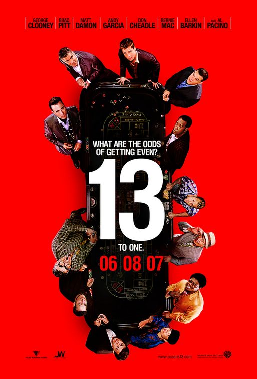
Ocean's Thirteen: You've got to be kidding me. We get it.
You have thirteen big-name actors in your movie. Congratulations.
It might help if you placed the camera a little closer to them
so that we can tell who's who. Making people squint to see
Brad Pitt's face is counter-productive. One again, the Ocean's
franchise falls very short and looks even lazier.
Poster Rating: F

Kafka: I'd never heard of Kafka before starting this post.
But this poster art has moved Kafka to "must-see" status.
The light and shadows are breathtaking and it captures
a very specific moment of time that I can't wait to see how
it plays into the film.
Poster Rating: B+

Sex, Lies, and Videotape: I don't know which country this
poster was constructed for but they apparently have awful
taste. Look at that ugly, fat font! Was that supposed to make
anyone want to see this? It certainly wasn't made to stand the
test of time.
Poster Rating: C

Solaris: The poster doesn't tell scream "LEAST ENTERTAINING
SCIENCE FICTION FILM EVER MADE" which is what Solaris is.
The poster, as a marketing tool, goes for a bait-and-switch tactic
but doesn't straight-up lie to you. The imagery represents the
themes of the film and, in context, does tell you a lot about the plot.
Great poster, terrible movie.
Poster Rating: A-

Gray's Anatomy: No, thank you.
Poster Rating: F

Bubble: Not only did Bubble have an original concept for its art
design but it also was distributed uniquely. During its theatrical
run, filmgoers could buy DVD copies of the film they just watched.
I was attending a different film but almost bought Bubble based
on the cover art alone. It's creepy, it's eye-catching, and it fits
the film well.
Poster Rating: B+

Full Frontal: The only thing worse than this Full Frontal poster
is the other Full Frontal poster.
Poster Rating: D-

The Informant: This is hands-down the best poster ever created
for a Soderbergh film but also it's the best poster of the year.
The colors and the fonts coupled together with that amazing picture
of Matt Damon have edged out past that amazing Precious
poster that everyone's been talking about. This movie owes at least
half of its earnings to this poster.
Poster Rating: A+

Full Frontal: This poster is shamefully lazy. Insert Photoshopped
pictures of each actor (don't worry if they're high quality pictures)
and slap a title on. Oh yeah, don't forget to display the stupidest
generic quotes possible. What about this poster is supposed to be
inticing? Cathleen Keener looking like a crack fiend? David Hyde
Pierce looking more attractive than Julia Roberts? Duchovny's
pajamas? Okay, maybe the pajamas are alright.
Poster Rating: F

Ocean's Twelve: A marked improvement on the original poster, the Twelve poster looks like at least a little thought went into it before it was sent to the printers. The color composition is intriguing, makes you want to figure out what's going on.
Poster Rating: C

Sex, Lies, and Videotape: Nothing says "An edgy, intense comedy"
like three pictures of people having aboslultely no fun whatsoever.
Have you ever seen a more bored group of individuals?
Poster Rating: D

Schizopolis: This is the cover art from the Criterion DVD release.
It matches how bizzare the film is and all of its elements piece
together well. The dotted background, various boxes, and the
Max Headroom-looking guy all work.
Poster Rating: B-

Che: This poster screams HBO Pictures biopic.
Poster Rating: C+

The Good German: A take on early war-time posters; Casablana
obviously had something to do with how this poster came out. Too bad
Casablanca didn't have any effect on how The Good German came out.
A painted poster would have been more authentic.
Poster Rating: B-

Out of Sight: This really is one of the worst posters I've never seen.
That being said, it doesn't crack the Top 5 for Bad Soderbergh posters.
Why is the gun pointed towards Clooney's head like that? Bleh. Lazy.
Poster Rating: D

King of the Hill: The font's design and colorization is pleasing
to look at. The character hanging upside down looks great.
The only downside is that awful tagline calling attention to him.
Poster Rating: B+

Traffic: FLOATING HEADS! And don't their positions make it
look like they should be funger puppets? Don Cheadle would
go on the thumb.
Poster Rating: C

Ocean's Twelve: By far the best poster this series ever had.
If you subtract the title and text, you're left with a pretty
cool piece of pop art. Try doing that with Erin Brockovich.
Poster Rating: B+

Erin Brockovich: The left side is all blurred out, her
transvestiteface doesn't help things, and the poster doesn't
tell you much about anything. Is this a Pretty Woman II
poster? Imagine what that movie would be like.
Poster Rating: C-

The Limey: Quite a few of Soderbergh's posters fall on
borderless white background. In some cases (Bubble
and King of the Hill) it works, in others (Full Frontal),
it does not. If you've got a white background, make sure
what you're putting on top of it is pleasing to look at.
Make it something interesting. Whoever designed The
Limey's poster definitely did that. Those black bars
are so much more appealing than horizontal, black
rectangles with the title inside (*cough*Full Frontal*cough).
Poster Rating: A-
Ocean's Thirteen: You've got to be kidding me. We get it.
You have thirteen big-name actors in your movie. Congratulations.
It might help if you placed the camera a little closer to them
so that we can tell who's who. Making people squint to see
Brad Pitt's face is counter-productive. One again, the Ocean's
franchise falls very short and looks even lazier.
Poster Rating: F

Kafka: I'd never heard of Kafka before starting this post.
But this poster art has moved Kafka to "must-see" status.
The light and shadows are breathtaking and it captures
a very specific moment of time that I can't wait to see how
it plays into the film.
Poster Rating: B+

Sex, Lies, and Videotape: I don't know which country this
poster was constructed for but they apparently have awful
taste. Look at that ugly, fat font! Was that supposed to make
anyone want to see this? It certainly wasn't made to stand the
test of time.
Poster Rating: C

Solaris: The poster doesn't tell scream "LEAST ENTERTAINING
SCIENCE FICTION FILM EVER MADE" which is what Solaris is.
The poster, as a marketing tool, goes for a bait-and-switch tactic
but doesn't straight-up lie to you. The imagery represents the
themes of the film and, in context, does tell you a lot about the plot.
Great poster, terrible movie.
Poster Rating: A-

Gray's Anatomy: No, thank you.
Poster Rating: F

Bubble: Not only did Bubble have an original concept for its art
design but it also was distributed uniquely. During its theatrical
run, filmgoers could buy DVD copies of the film they just watched.
I was attending a different film but almost bought Bubble based
on the cover art alone. It's creepy, it's eye-catching, and it fits
the film well.
Poster Rating: B+

Full Frontal: The only thing worse than this Full Frontal poster
is the other Full Frontal poster.
Poster Rating: D-

The Informant: This is hands-down the best poster ever created
for a Soderbergh film but also it's the best poster of the year.
The colors and the fonts coupled together with that amazing picture
of Matt Damon have edged out past that amazing Precious
poster that everyone's been talking about. This movie owes at least
half of its earnings to this poster.
Poster Rating: A+

Full Frontal: This poster is shamefully lazy. Insert Photoshopped
pictures of each actor (don't worry if they're high quality pictures)
and slap a title on. Oh yeah, don't forget to display the stupidest
generic quotes possible. What about this poster is supposed to be
inticing? Cathleen Keener looking like a crack fiend? David Hyde
Pierce looking more attractive than Julia Roberts? Duchovny's
pajamas? Okay, maybe the pajamas are alright.
Poster Rating: F


9 comments:
Strangely, my favorite is missing from this post...What was your take on the orange theatrical poster for OUT OF SIGHT?
You know, I'm going to have to claim ignorance on that one. I had never seen that poster before and when I ran across it yesterday, I thought it was fan art. If I can stomach the idea of messing with Blogger any more today, I'll add it. Thanks for commenting, by the way.
Bubble has always stuck with me, it's a combo of my phobia of dead-eyed dolls, mixxed with that cheap, trailer park lettering just made me uncomfortable (but still loved it). And Informant just so reminds me of an Apatow poster (The 40-Year-Old Stoolie), you just gotta go see it based on that alone.
Hilarious! I'd love to see this kind of run down with other directors - you should start a series.
But yeah, Blogger isn't a lot of fun when it comes to formatting and spacing photos. I'm with you there.
That Ocean's 13 poster is horrendous.
Sexy Laura San Giacomo on the poster?? A++++
I love this post! more thought should be put into the art of movie posters, goddang it!
Excellent post and well worth the time. Agreed that Blogger can be a bitch with this stuff, but I think I've finally figured most of it out.
Thankfully, Hatter already said what I was going to. It's a damn crime that you included the DVD "poster" for Out of Sight; that's one of my all-time favorite movie posters, much less just of Soderbergh's. The bigger crime is that they changed it for the DVD release and that the one you used is the one most associated with the movie at this point. Evil. You must edit. :D
@ Fletch... OK, here's where I have to be "that guy". The orange poster we've been talking about was the theatrical poster for this flick...the half-assed photoshop composite posted here was the DVD cover. (I actually have a copy of the orange poster rolled up somewhere...I need to get that sucker framed someday).
This actually is an example of a trend I hate in hollywood...creating horribly dumbed-down artwork for DVD's. It's like studios think Best Buy shoppers need their movie stars spoonfed to them...
...actually, maybe they aren't that far off.
No need to be that guy, Hatter, or if you are, then I am, too. My post might have been confusing, but I was saying the same thing...and I, too, have a copy of the orange one in a tube somewhere.
Trust me, I could have said the same thing as it relates to Ocean's Eleven. After all, this is the poster I associate with that flick, though I'm pretty sure the one elgringo used was used prior to the DVD release (I have a copy of the good one here somewhere, too).
Post a Comment