Since "Soderberg's Posters" and "Cameron's Posters" went over so well, I'm keeping things rolling with PART ONE of Martin Scorsese's posters. Part Two will be coming soon.
As a bonus, the first person to guess the THEME of Part Two (or, what the missing Scorsese posters have in common) before I post them will get an extra entry slot in February's Thanks For Writing contest.
Ladiesandgentlemenherewego.
 The Departed: There are things I like and don't like about using the cut-out letters to spell out the film's title. Here's what I like. The artists seemed to be heading towards using the dreaded "Floating Heads" design which almost never looks good. The cut-outs provide some framing for those magical flying heads. It's an interesting technique that isn't frequently used on movie posters and while it could have been used much better, the poster definitely could have been worse.
Here's what I don't like about the poster. The cut-outs spell "The Departed." But the artist didn't have enough faith in his design not to just write "The Departed" next to the cut-outs. So, now, the poster reads "The Deaprted The Departed. Also, what's up with Nicholson's face? Look at that. Damon and DiCaprio don't have huge chunks of their faces missing. I should also point out the huge, unused negative space in the bottom left hand corner. This poster started out with an okay concept, didn't take advantage of it, and ended up with a sup-par poster.
Poster Rating: B-

Bringing Out the Dead: This is a fantastic poster. The red and black contrast make the imagery stand out, the title stand out, and the even the poster itself stands out against its competitors. The cross directly relates to the Cage's character's profession and his eyes speak more about his present frame of mind than 10 minutes of explanitory dialogue. A simple yet effective design executed perfectly.
Poster Rating: A
 Kundun: First off, that's a great tagline. "A destiny of a people lives in the heart of a boy." If that doesn't set you up for Kundun, there isn't much that will. The photograph of the young Dalai Lama looks great. The child's expression is awfully apathetic but the ligthing behind his head says just how great he'll be. Behind him stand the people he's going to save and the land they live in. Other than the stereotypical typeface, this is a strong poster.
Poster Rating: B+
 The Last Temptation of Christ: This is one of Scorsese's strongest poster. The illustrations of the iconic thorn crown extend past the poster and other than that ugly white text box sitting uncomfortably on that beautiful drawing. There's no reason why the title couldn't have been repositioned beneath the thorns. But even with that God-awful (pun intended) box, it stands out in Scorsese's Top 5.
Poster Rating: A-
 The Color of Money: I'm a sucker for painted movie posters. I feel something was lost when the transition to PhotoShopped images became the new standard. For The Color of Money, the artist captured Newman's unstoppable swagger. Cruise, after a string of blockbuster hits, gets equal billing when it comes to name size but his portrait literally fits inside Newman's. It's less detailed, of a lower quality, and if it wasn't for poor Mary Elizabeth Mastrantonio, no one would believe that Cruise was anything more than a good looking actor with a bit part. This isn't my favorite painted poster but there have been worse.
Poster Rating: B

After Hours: Haha, this poster is the sole reason it took years for me to watch After Hours. From the ugly Twizzler-styled title to the confusing clock metaphor. Some posters just seem to say "There's nothing worth watching here" and for me, this poster couldn't stop saying that. But once I eventually watched the film, it became clear that the artwork matched the script's comedic style. Either way, the artwork's outdated and corny and even though I'm usually a fan of 80s/90s comedy posters, this one doesn't do a thing for me. It doesn't make me gag, it just makes me uninterested.
Poster Rating: C

The King of Comedy: No, no, no, no, no, no, no, no. Starting at the top, why two taglines? Why an ugly gray background? And WHY would you think that drawing DeNiro and Lewis on playing cards would make anyone want to see your movie? Just because the word "King" is in your title doesn't give you permission to try passing off something like this. It's art direction like this that can sink a movie. And it's probably art direction like this that did sink The King of Comedy.
Poster Rating: D
 Raging Bull: The poster's as iconic as the movie itself. I can't tell you how many (dorm) rooms I've seen with this poster hanging on the wall. Little needs to be said about this poster. Everything the movie did right, the poster did just as well. Whoever's responsible for that picture of DeNiro should have won an Oscar. In fact, why isn't there a Best Poster Oscar? Anyone up for a letter writing campaign? The only things I don't care for are the quotation marks around the title.
Poster Rating: A

The Last Waltz: This looks like a cover for an early-90s steamy thriller novel that my grandma might keep in a decorative basket in the bathroom. That font...that gold...sweet Moses. It's like someone took a champagne colored Buick LeSabre and transformed it into a movie poster.
Poster Rating: D-

Taxi Driver: I love the font and the curding (spacing) between the letters. And what a great choice to keep the design simple. Taxi Driver doesn't need a tagline. Taxi Driver doesn't need color. Like the Raging Bull poster, all you need is DeNiro. It doesn't hurt to put DeNiro on the last city street I'd ever want to visit. Except for this one. Or this one. The choice to show Bickle without his signature mohawk was the right one to make. Unless it's a monster movie or a superhero movie (and maybe Taxi Driver could be argued as either), showing the latter end of a character's transformation on the poster cheapens the impact of the evolution.
Poster Rating: A+
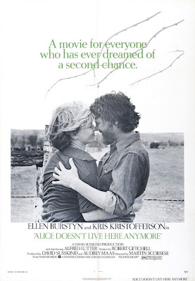
Alice Doesn't Live Here Anymore: The black and white isn't very crisp and the (branches?) jutting into the frame are distracting. Unlike Travis Bickle's surroundings, the (farm?) they're standing in front of doesn't say much about anything. They're outside. They're not downtown Manhattan. But it doesn't say much else. Also, if I had designed Alice's poster, I wouldn't have featured Kristofferson. It's Alice's strength and resilience that makes the film so compelling. This cuddle session makes Alice look like just another romance. And that tagline makes me barf.
Poster Rating: C
 Mean Streets: If I had to use four words to describe the Mean Streets poster, I'd have to call it "exquisite, savage, compassionate and brilliant." But seriously, whoever designed this poster (and I tried to track down a name) deserves an award. Why isn't there an Oscar for Best Poster? Maybe then studios would put a little more effort into their one-sheets. Notice how the gun (or violence) is literally a part of the city. It's as natural as the buildings and the people inside them. Even it's smoke is absorbed into the skyline and used as clouds. The poster makes an excellent use of negative space and says just as much about Mean Streets as its trailer.
 Poster Rating: A+
 Boxcar Bertha: The photograph that Hershey's portrait was based off of has one big difference: the big ol' shotgun in Bertha's hand. Seeing her without the weaponry makes her look like a laid-back flower child with nothing better to do than stare into the sky. Look at all the action around her. A train's going off the tracks. A group of cops are chillin' with their rifles. I mean, Jesus Christ, someone's getting crucified! Now look at the film's protagonist. Does this picture say "outcast?" Or "outlaw?" Not at all. If it wasn't for the poorly written tagline, we'd have no clue that Bertha was anything but a pretty girl with a glazed look in her eyes. And that is definitely not how to sell a movie like Boxcar Bertha. The bottom half is an exciting adventure. The top half might be sleepy or bored or delightfully deranged. One last side note, none of the fonts on this poster match one another and that's just sloppy poster-making.
 Poster Rating: C











 Posts
Posts